A good logo for a small business is simple enough to recognise at the size of a thumbnail, clear about what the business is called, and built to work in one colour as well as full colour. It should look right on a van, a website header, a social media profile picture and an invoice without being redrawn each time. Fancy details, five colours and a trendy font usually fail at least one of those tests.
Below are the seven rules we design to, with real logos we've made for Yorkshire trade businesses, plus the versions and files you should get from any designer.
What makes a good logo? The 7 rules
- Simple. One idea, not three. If you can't sketch it from memory, it's too busy.
- Readable at small sizes. It has to work as a 32 pixel browser icon and a round profile picture.
- Works in one colour. Embroidery, stamps, window vinyl and black and white printing all need it.
- Says the name clearly. Most small businesses aren't famous enough for a symbol on its own.
- Fits the trade and the customer. A gas engineer and a Pilates studio shouldn't look interchangeable.
- Different from local competitors. Check the businesses people will see next to you on Google Maps.
- Timeless over trendy. You'll live with it on signs, vans and uniforms for years, so avoid this year's fashionable font.
If you'd rather hand the whole job over, our logo and graphic design service covers the logo, the versions and every file you need, quoted up front.
Real examples: three trade logos we designed
Nearly every guide on this topic uses Nike and Apple. They're not much help to a plumber in Leeds. Here are three small business logos we designed, and why they're built the way they are.
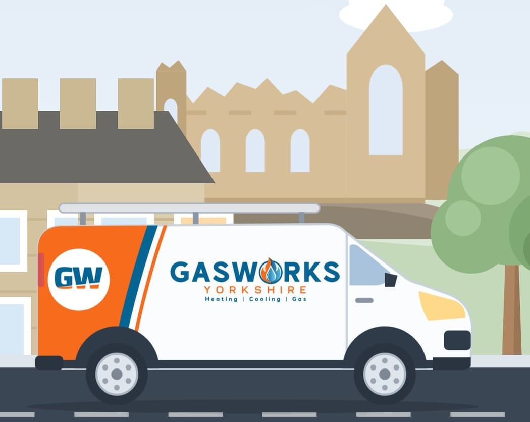
Gasworks Yorkshire: a logo that has to work on a van
Gasworks Yorkshire are Gas Safe registered heating, plumbing and gas engineers covering Leeds, Harrogate and York. Their logo has a bold wordmark with a flame and water drop inside the O, plus a separate GW monogram, in Gasworks blue (#046494) with a flame orange (#F76B1C) accent.
The orange is used sparingly: the flame, the word Yorkshire and a bold panel on the van. The blue carries everything else, so the logo still holds together printed in a single colour, and the round GW monogram gives the van something you can read from across a street.
Chevin Electrical: one logo, four layouts
Chevin Electrical Contractors are NAPIT approved electricians in Otley. Their brand comes as a wide lockup for the website header, a stacked version for square spaces, a monogram on its own, and a one colour graphite version for anything printed in a single ink.
That's the point of versions: the same logo, rearranged to fit the space, rather than squashed.
Kearsley & Co: colour that matches the customer
Kearsley & Co Gas Services are Gas Safe engineers based in Yeadon, covering Guiseley, Rawdon and Horsforth. We built their brand around navy (#274069) and gold (#DDC578), with a flame monogram that also works in gold on deep navy, and a short line underneath that says exactly what they do: gas, plumbing, air conditioning. Navy and gold read as established and trustworthy, which suits a business going into people's homes.

Which logo versions does a small business need?
You need at least five versions of your logo. One file is never enough, because a header, a profile picture and a dark photo all need something different.
| Version | What it is | Where you use it |
|---|---|---|
| Primary lockup | Symbol and name side by side | Website header, letterheads, email signature |
| Stacked | Symbol above the name | Square spaces, signage, uniforms |
| Monogram | The symbol or initials on their own | Social profile pictures, browser icon, stickers |
| Reversed | White version for dark backgrounds | Over photos, dark vans, dark website sections |
| One colour | A single solid colour | Embroidery, stamps, vinyl, black and white print |
Every logo we design comes with full colour, white (reversed) and one colour versions, a monogram for small spaces, your brand colours and your fonts.
Which logo files should you get?
Ask for vector files as well as image files. Vector files (SVG, PDF or EPS) can be scaled to any size without going blurry, so your sign maker and printer will want them. Image files (PNG) are what you upload to your website and social media.
| File | Type | Use it for |
|---|---|---|
| SVG | Vector | Websites, and most sign and print suppliers |
| PDF or EPS | Vector | Printers, embroiderers, vehicle graphics |
| PNG with a transparent background | Image | Website, social media, documents |
| JPG | Image | Only when a platform won't take PNG |
If a designer only sends you a single JPG, the job isn't finished. You'll find out the first time a printer asks for "a vector".
Colours and fonts: keep it to a short list
Most good small business brands use two or three main colours and one or two fonts. Chevin Electrical uses three colours (Chevin blue, steel grey and graphite) and one typeface, Archivo. Kearsley & Co uses one font, Roboto Condensed, across everything.
Write the exact colour codes down and share them with anyone who makes anything for you. It's the cheapest way to make your van, website and social posts look like the same business.
Test it where it will actually live
Before you sign off a logo, put it in the real places it'll be seen:
- As a round profile picture on Instagram or Facebook
- In the corner of a website on a phone
- On a dark photo, using the reversed version
- Printed in black and white on an invoice
- On a LinkedIn banner or a pull up banner at an event
We designed LinkedIn and pull up banners for CC Coaching, and that's where weak logos show themselves: a pull up banner is read from across a room in a few seconds. If your logo only looks good large and in colour, it'll struggle there.
Do you own your logo?
You should. Get it in writing that the copyright in the final logo passes to you once it's paid for. With us, the designs and files are yours once the work is complete and paid for.
Ownership isn't the same as a trade mark. If you want legal protection for your name and logo, you can register a UK trade mark with the Intellectual Property Office. GOV.UK says it costs at least £205 and usually takes around 3 to 4 months if there are no issues. Check the register before you commit to a name, too.
What to put in a logo design brief
A good brief saves rounds of changes. Tell your designer:
- What you do, in one sentence, and where you work
- Who your customers are and what they worry about
- Three words you want people to think when they see you
- Two or three local competitors (so you don't look like them)
- Where the logo will be used most: van, shopfront, website, uniforms, social
- Any colours you love or hate, and anything you must keep from an old logo
Our process runs the same way every time: you tell us about the business, we come back with first designs built around that brief, you choose a direction and we refine it, then you get every final file for print, web and social.
When a new logo isn't the answer
If customers already recognise your logo, a full rebrand can cost you that recognition. Often the better job is a tidy up: redraw it cleanly as a vector, add a monogram and a one colour version, and fix the colours. It's the same thinking as deciding whether you need a full website redesign or just a few fixes.
A new logo also looks best alongside photos of your real team and premises. Our guide to brand photography for small businesses covers that side.
Want a logo that works on your van, your website and your profile picture? Get in touch for a free chat and a clear quote before any work starts. You'll deal directly with Ella and Alex, we reply within 1 business day, and our clients rate us 5.0 from 9 Google reviews.
Written by Ella Bromhead, cofounder and Director of Social Media and Photography at Marketing Handled, who leads our logo and brand design work.
FAQs
What are the 5 rules of a good logo?
The five most quoted rules are simple, memorable, timeless, versatile and appropriate for the business. For a small business we'd add two more: it must be readable at tiny sizes, and it must work in one colour for print and embroidery.
What file formats should I get for my logo?
Get vector files (SVG, and PDF or EPS) for printing and signage, plus PNG files with a transparent background for your website and social media. A single JPG isn't enough, because it can't be scaled up without going blurry.
Do I own my logo if a designer makes it?
Only if your agreement says so. Make sure the copyright passes to you once you've paid; with Marketing Handled, the designs and files are yours once the work is complete and paid for. A trade mark is separate and is registered through the Intellectual Property Office.
Should a small business logo include the business name?
Yes, in almost every case. Symbols on their own only work once people already know you, so keep the name in your main logo and use a monogram for small spaces like profile pictures.
How many colours should a logo have?
Two or three is plenty for most small businesses. The logo should also have a one colour version that still works in black, white or a single ink.